SellerDeck 2013 now has the facility to enable a customer choice to be conditional on selected options
Under certain circumstances you may wish the choice made by a customer for one attribute to affect the options offered for another. The 'Dynamic Choices' feature provides for this type of dependency, allowing invalid combinations to be suppressed dynamically on the web site.
The Dynamic Choices feature is enabled by default for all products. The function comes into effect wherever a product has a Component with multiple Attributes. The Component is required, but can be hidden by blanking the �HTML for Name� field in the General tab of the Component Details.

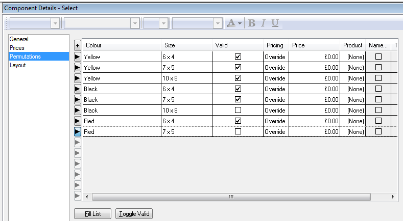
To define which combinations of choices are valid and invalid, go to the �Permutations� tab of the Component and click the �Fill List� button. Then untick the �Valid� checkbox for any permutations that you want to prevent being ordered:

NB:The �Fill List� button is disabled if all possible combinations are already listed in the table.
NOTE: Dynamic Choices requires Javascript to be enabled in the browser. Shoppers who do not have Javascript enabled will always see all possible combinations. If they attempt to select an invalid combination they will be notified when they try to add it to the cart.
Dynamic Choices can be disabled for any product in its Properties tab, by setting Suppress Invalid Product Choices Dynamically� to �False�; or disabled for the whole site in Settings | Site Options | Properties | Product.
The 'General' Panel and 'Prices' Panel
Once you have created attributes and choices within a component, then the settings within the 'Component' panel and 'Prices' panel start to take on a slightly different meaning to how they are described under normal operation.
Under certain circumstances you may wish the choice made by a customer for one attribute to affect the options offered for another. The 'Dynamic Choices' feature provides for this type of dependency, allowing invalid combinations to be suppressed dynamically on the web site.
The Dynamic Choices feature is enabled by default for all products. The function comes into effect wherever a product has a Component with multiple Attributes. The Component is required, but can be hidden by blanking the �HTML for Name� field in the General tab of the Component Details.
To define which combinations of choices are valid and invalid, go to the �Permutations� tab of the Component and click the �Fill List� button. Then untick the �Valid� checkbox for any permutations that you want to prevent being ordered:
NB:The �Fill List� button is disabled if all possible combinations are already listed in the table.
NOTE: Dynamic Choices requires Javascript to be enabled in the browser. Shoppers who do not have Javascript enabled will always see all possible combinations. If they attempt to select an invalid combination they will be notified when they try to add it to the cart.
Dynamic Choices can be disabled for any product in its Properties tab, by setting Suppress Invalid Product Choices Dynamically� to �False�; or disabled for the whole site in Settings | Site Options | Properties | Product.
The 'General' Panel and 'Prices' Panel
Once you have created attributes and choices within a component, then the settings within the 'Component' panel and 'Prices' panel start to take on a slightly different meaning to how they are described under normal operation.
- Component Name: The name of the component as it will appear in the shopping cart and the order. This will be added just in front of your attribute and choice details.
If you select 'Use Associated Product Name' (within the 'Permutations' panel) then the name of the associated product will be used in the shopping cart and in the order processing. - Price field (Catalog) / Prices panel (Business/Designer): Enter a price for the component. This price will only be used if the 'Pricing' field of a permutation is set to 'Component Prices'.
If you are using SellerDeck Business/Designer, you can use the 'Prices' panel for setting up quantity-based pricing and customer-based discounts. - HTML for Name: Use this field to determine how the component will be labelled in the store pages.
If you leave this blank, then nothing about the component will appear in the store page � only the details of the attributes and choices will appear. - Quantity Used: Decide how many instances of the attribute/choice selection made you want to supply with each product.
- Component as Separate Order Line: Select this box if you want the component to appear within its own separate line in the shopping cart, and in the SellerDeck order processing system.
If you do not select this box then the details about the component will just appear as part of the product name.
Also, if you do not select this box, you will not be able to select 'Use Associated Product Tax' within the 'Permutations' panel. - Is Optional: This box determines whether the component is optional or not. This means that it becomes optional whether or not the customer has to make a selection from your attributes and choices.
If you are just using the component to supply choices with a product automatically, then leave this box unselected. - Selected By Default: If the component is optional, then you can select this box in order to have the component selected by default.
- Include [None] In Attribute Choice List: If you only have one attribute within a component, then the option of not having the component can be included as an option in the list of choices. Change 'None' to however you want your 'no-selection' choice to appear.