Hi
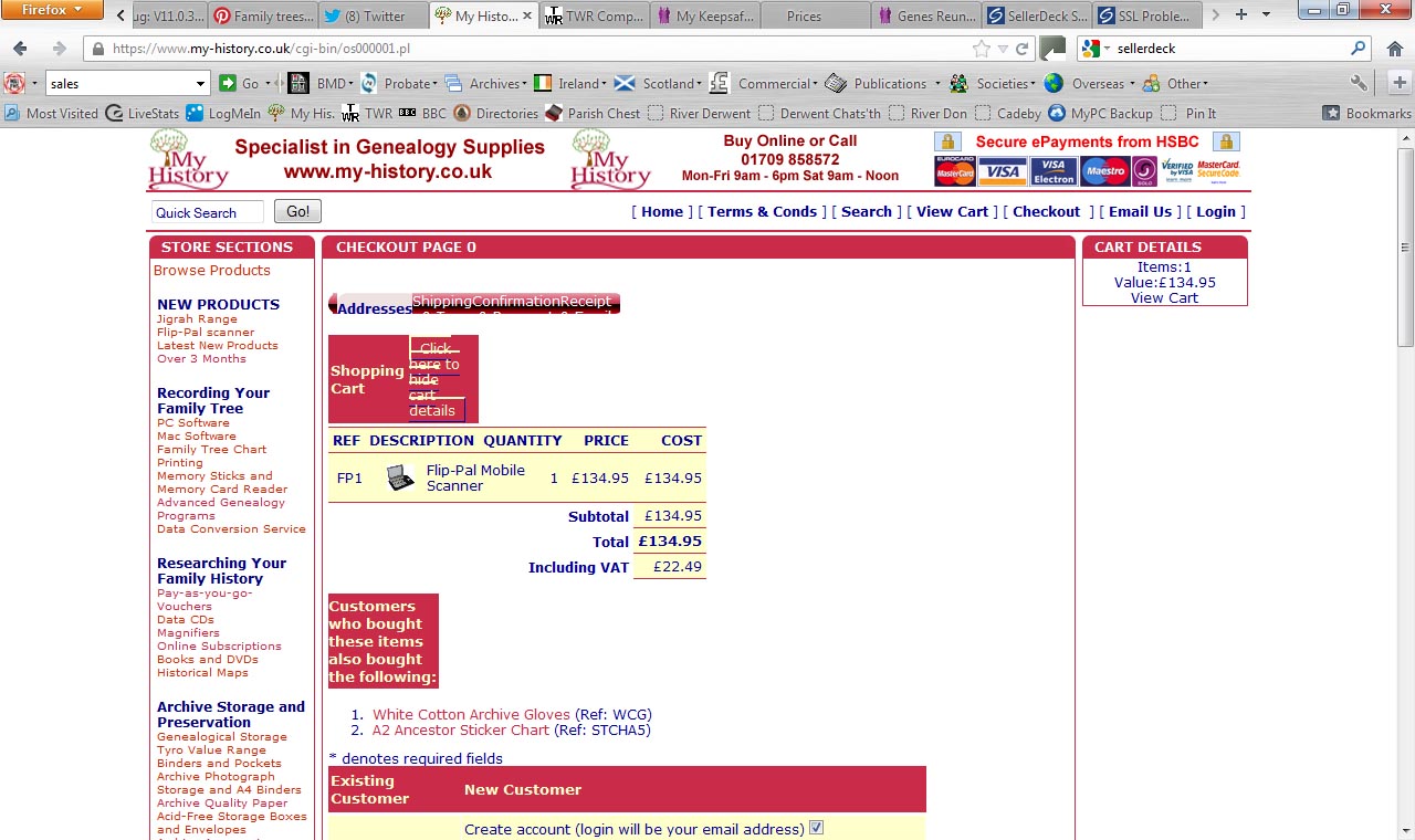
I have a rather urgent problem as we have just updated to v11.0.3 MHDB and our cart now looks awful. see attached. I have spent most of Saturday evening trying to sort this out but I am not getting anywhere. All help will be appreciated.
see image:
I have a support contract but for some reason the new Sellerdeck 24/7 system doesn't recognise my email to send me a password but i guess i will have to wait until Monday to sort that out.
Tony
I have a rather urgent problem as we have just updated to v11.0.3 MHDB and our cart now looks awful. see attached. I have spent most of Saturday evening trying to sort this out but I am not getting anywhere. All help will be appreciated.
see image:

I have a support contract but for some reason the new Sellerdeck 24/7 system doesn't recognise my email to send me a password but i guess i will have to wait until Monday to sort that out.
Tony
Comment