Announcement

Collapse
No announcement yet.

Advice On Website

Collapse
X
 
  • Filter
  • Time
  • Show
Clear All
new posts

    #61
    It's like that Spike Jonze film all over again here this morning - "Being Lee Hackett", where 2 luckless souls wander down the Actinic tunnel and find themselves inside Lee's mind!
    Fergus Weir - teclan ltd
    Ecommerce Digital Marketing

    SellerDeck Responsive Web Design

    SellerDeck Hosting
    SellerDeck Digital Marketing

    Comment


      #62
      Originally posted by fergusw View Post
      It's like that Spike Jonze film all over again here this morning - "Being Lee Hackett", where 2 luckless souls wander down the Actinic [tunnel and find themselves inside Lee's mind!
      that IS a truly terrifying thought!
      Tracey

      Comment


        #63
        I'm feeling bullied and persecuted, i'm afraid i will have to report this thread to the mods. Hmmm then again i can photoshop too.....hmmmm. Sharkey watch out...

        Comment


          #64
          Originally posted by parklifeclothes View Post
          browsers expect certain things on a website such as place of basket, contact details etc. When those things aren't where expected you lose (confuse) people. I know that 90% of websites I will go on today will have the products one above the other in a left naviagation bar, the basket will be top right hand corner and that is what people expect.
          Is this not the layout of the site, just modified so it doesn't look like another template ecommerce site? We have tried (and obviously failed) to create a site which is different from the standard but still works in the same way.

          The contact is at both the top and bottom (Admittedly in the 'Information' section) but people really aren't that dumb. The product sections list across the top, with their child sections underneath and also listing on the left, once entering into a section that contains products, the same is replicated with the products listed along the top and down the left.

          Is this not the same as most ecommerce sites?

          This whole thread was asking for why people were having difficulty using the site when I asked for help last week.
          It has turned more into a 'have a go at the Dan for doing it different' thread.

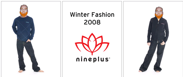
          Thanks for all those who have given some insight into why and how the site should be changed, I will take that onboard and work to make it better, but some peoples comments are quite damaging and unnecessary, and please can we keep comments about the people used on the site impersonal. They were used because they were used, and if it was my decision, i wouldn't have used those people, but it wasnt. Thanks

          Anyway, I'm in the office today, ready to chip away at the site....

          =)
          Nineplus.com - Surfboards, Longboards, Wetsuits and Accessories.

          Comment


            #65
            Originally posted by sgtbash View Post
            I would love your suggestions on improving the site.
            Thanks in advance
            Hmm. I must have misunderstood what you meant by this.
            Reusable Snore Earplugs : Sample Earplugs - Wax Earplugs - Women's Earplugs - Children's Earplugs - Music Earplugs - Sleep Masks

            Comment


              #66
              Originally posted by sgtbash View Post
              but people really aren't that dumb.
              I'm afraid you'll find they are Dan. You have to really spell it and make things obvious to people or they will simply go away. If I was looking for your address, I would scour the site looking for anything that suggested Contact Info, Contact Details or Contact Us. Not being able to find an address and telephone number will put a lot of people off.

              Originally posted by sgtbash View Post
              The product sections list across the top, with their child sections underneath and also listing on the left, once entering into a section that contains products, the same is replicated with the products listed along the top and down the left.

              Is this not the same as most ecommerce sites?
              Unfortunately this is not clear enough. Get rid of the Nine Plus that proceeds each section and make the navigation bigger. Also help your users and include a search facility.

              I think I understand what you are trying to achieve, with respects to the ethos of nineplus, but I would have done it slightly differently.

              Use your brochure pages to talk about Lotus Surfboards, Carbon Neutral, Craftmanship, etc. Keep this information out of the catalog area. This way people that want to find out more about you can read pages and pages of content but the product side of things is much simpler and direct.

              You can even link to your brochure pages from your products and visa versa, but having a massive amount of text and images on the Nineplus Surf page distracts from the product links on the left hand side.

              The guys here are trying to help and tone is often lost in the written word, but going on the offensive and accusing people of having a go, because that will put people off helping you in the future.

              We're good people... Honest

              Army Gore-tex
              Winter Climbing Mitts
              webD's Blog: Website design, SEO and other ramblings…
              Twitter LinkedIN

              If you think a post is good, rate it!

              Find the answers in the Knowledge Base | Have you read the User Guides

              Comment


                #67
                Originally posted by guccij View Post
                Hmm. I must have misunderstood what you meant by this.
                What is there to misunderstand. The thread before this when I was asking for help with a problem people were having trouble.

                So i have started a new thread asking why people thought they were having trouble and what they think can be done about it.

                Is that not asking for improvement?
                Nineplus.com - Surfboards, Longboards, Wetsuits and Accessories.

                Comment


                  #68
                  Originally posted by webD View Post
                  I'm afraid you'll find they are Dan. You have to really spell it and make things obvious to people or they will simply go away. If I was looking for your address, I would scour the site looking for anything that suggested Contact Info, Contact Details or Contact Us. Not being able to find an address and telephone number will put a lot of people off.


                  Unfortunately this is not clear enough. Get rid of the Nine Plus that proceeds each section and make the navigation bigger. Also help your users and include a search facility.

                  I think I understand what you are trying to achieve, with respects to the ethos of nineplus, but I would have done it slightly differently.

                  Use your brochure pages to talk about Lotus Surfboards, Carbon Neutral, Craftmanship, etc. Keep this information out of the catalog area. This way people that want to find out more about you can read pages and pages of content but the product side of things is much simpler and direct.

                  You can even link to your brochure pages from your products and visa versa, but having a massive amount of text and images on the Nineplus Surf page distracts from the product links on the left hand side.

                  The guys here are trying to help and tone is often lost in the written word, but going on the offensive and accusing people of having a go, because that will put people off helping you in the future.

                  We're good people... Honest
                  Thanks for that mate, I have always been cautious when asking for help on the forums as this is exactly what happens. So the one time I put my neck out asking for help - it gets chopped off. =(

                  I appreciate everyones comments and thoughts on the site, and it may not be the best actinic ecommerce site ever, but its doing its job, and the sales prove that.

                  I'm a bit disheartened that 'everyone' on here seems to find that the site doesn't work.

                  Anyway, I will get to work over the next couple of days trying to make it a bit easier.
                  Nineplus.com - Surfboards, Longboards, Wetsuits and Accessories.

                  Comment


                    #69
                    Originally posted by sgtbash View Post
                    The 'family has grown' statement is talking about when Nineplus itself split into 3 earlier this year
                    That'll have been when Money Well Spent bought the brand, I guess. CH is a mine of useful information for nosey people like me
                    Reusable Snore Earplugs : Sample Earplugs - Wax Earplugs - Women's Earplugs - Children's Earplugs - Music Earplugs - Sleep Masks

                    Comment


                      #70
                      Does your log cabin have some like satellite phone which connects you to anywhere you want to find out what you want? How tall am I? What am i doing now Jules as you read this?

                      Comment


                        #71
                        Eewwww that's gross Lee stop that RIGHT NOW. You know what I'm talking about. I said, STOP IT.

                        See - Heidi knows EVERYTHING, sees EVERYTHING.


                        PS Currently the log cabin is being dehumidifed thanks to crap plumbing work in a neighbour's kitchen. Hence we are still in the UK
                        Reusable Snore Earplugs : Sample Earplugs - Wax Earplugs - Women's Earplugs - Children's Earplugs - Music Earplugs - Sleep Masks

                        Comment


                          #72
                          Originally posted by guccij View Post
                          That'll have been when Money Well Spent bought the brand, I guess. CH is a mine of useful information for nosey people like me
                          Sure was, whats CH?
                          Nineplus.com - Surfboards, Longboards, Wetsuits and Accessories.

                          Comment


                            #73
                            CH = the government department that adds red tape and expense to the every day life of limited companies (and allows Jules to be nosey )
                            Elysium:Online - Official Accredited SellerDeck Partner
                            SellerDeck Design, Build, Hosting & Promotion
                            Based in rural Northants

                            Comment

                            Working...
                            X